|
|
|
|
Yup, here's a section for the uh... three people who are actually interested in some of the strange old layouts and banners DBA's gone through in the last three years. Early 2000... Back to the dark ages... when frames were a Neat Way to Make a Page. (Ugh...) Yup... here's basically what my site was like when I first started it... with alternating background colours! Yay... Yup, and I used to suck this much at drawing too! Here's the first banner I used... (hey, just remember the only graphics program I had at this stage was Paint brush.)
Late 2000... And from here I quickly realised that while getting rid of the frames made the page look a whole lot better, but it meant I had to start getting the page uniform. Something like 6 hours of cutting and pasting later... voila! We have an only marginally less crappy layout! But here's the new banner... major improvement, but still pretty dodgy, as it was completely drawn on computer. Yay for Paintshop Pro...
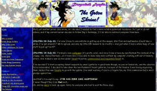
2001 Now we have the layout that I was actually happy with! ... for about a month. And a brand new concept... organising the huge list of sections into subjects! (Now I no longer had to and the link to every single page to add a section! Wow...) But, while the layout was now better organised and worked well... it was still (to use the words of Misutiku) 'psychadelic'. I designed the banner and layout separately. Big mistake... the colours clashed way too much. I kinda liked the banner, but it just didn't go with the rest of the page. Still... the fanart was finally reaching an acceptable level, and the text was beginning to look more readible.
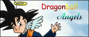
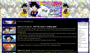
2002 And so we have... the current background and banner. I didn't want to go for the traditional black background style layout, or anything too dull. Goten's cute and bright and happy, so I didn't want anything moody. I was finally learning some html and getting the hang of my graphics programs, so I put the two together. The banner has the traditional fanart, Goten as an angel, but I wanted to do a long narrow banner, and the fanart I had didn't quite fit, hence the extra bubbles of fanart. The text was pretty hard to fit in as I wanted to put the site's initials as well as the full title... but I think it looks okay.
|
|||